Excel Hints & Tips – Florence Nightingale & Excel

What on earth has Florence Nightingale got to do with Excel?


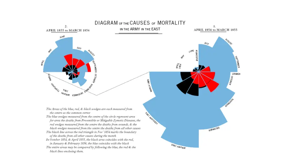
Florence Nightingale famously created a polar area diagram (a type of pie chart) in 1858 to show the cause of death in British military hospitals in the Crimean War. This highlighted the extent of preventable deaths (such as from typhus and cholera). The result was that the British government took action and commissioned Isambard Kingdom Brunel to design a new civilian hospital – reducing the death rate to just 1/10th of what it was before.


This important use of data visualisation shows how powerful charts (and especially pie charts) can be.

Want more ideas for creating happy, productive workplaces?

Sign up for our Happy Manifesto newsletter and discover fresh ways to ignite joy and productivity at work. Get expert tips, insights, and ideas that challenge the norm—straight to your inbox. Join our movement and start your journey for a trust-based, values-led organisation.