Excel Hints & Tips – Florence Nightingale & Excel
What on earth has Florence Nightingale got to do with Excel?
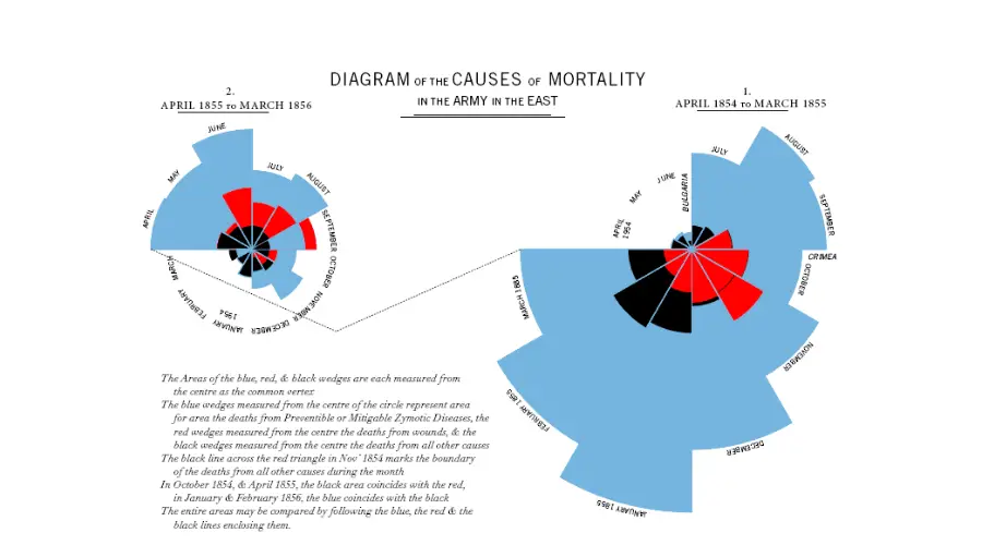
Florence Nightingale famously created a polar area diagram (a type of pie chart) in 1858 to show the cause of death in British military hospitals in the Crimean War. This highlighted the extent of preventable deaths (such as from typhus and cholera). The result was that the British government took action and commissioned Isambard Kingdom Brunel to design a new civilian hospital – reducing the death rate to just 1/10th of what it was before.
This important use of data visualisation shows how powerful charts (and especially pie charts) can be.
“Pick Your Own Manager”
This morning I was delighted to get an email (subject line “….eek!”) from a colleague at one of the UK’s major facilities management companies:
“Yesterday we put out a communication to our helpdesk employees that they can… Pick their own manager!”
The Most Creative Annual Report Ever?
A big thanks to Marion Janner of Star Wards, @starwards, for alerting me to this fabulous approach to an annual report. And its not from a cutting edge startup, but from the public sector, the good old NHS: The annual report for Whittington Hospital Trust for 2004.
Bring Back the People, We Need More Than Technology

This festive period I was avoiding Amazon (because of their UK tax avoidance) and found myself in a real bookshop. And what a delight. I could have spent hours there. I know, it is sad that this is rare experience for me.
Excel Hints & Tips – Timeline
How to use the Timeline feature in Excel 2013/2016.


