Work Smarter with Google Groups Using Our Guide

Google Groups makes it easy for groups of people to keep in touch with friends, connect with people who have similar interests, and organise projects and presentations such as project teams, departments, or teamwork to communicate and collaborate easily.
Here’s a look at some attention-grabbing features to have shown up in recent months.
Excel Tips: Using Charts and Sparklines
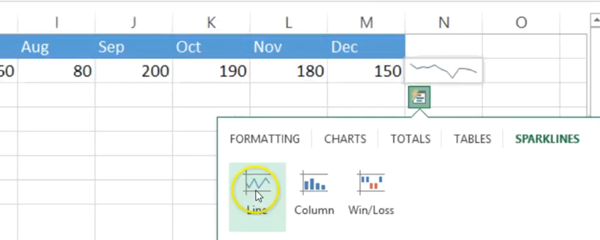
Learn how to quickly analyse your data in Excel using charts and Sparklines in this two-minute video – now with subtitles!
Sparklines are small charts in a single cell – perfect if you are short on space but want a quick view of what’s going on with your data. With Excel you can also create full-size charts with just a few clicks. Find out how in this week’s video.
How to Use the Data Consolidation Feature in Excel
Do you need to view and compare lots of data in a single spreadsheet? There is a quick and easy way to do this – using the Data Consolidation tool. In this blog, Edmund, one of our Excel experts, shares his top tips.
321zero: How I Solved my Email Overload

Email overload is a common problem at work. Here is how you can drastically reduce the time you spend on responding and dealing with your inbox.
Using COUNTIF for Better Data Analysis and Validation
COUNTIF is a powerful tool that can help you to make sense of large sets of data, pulling out the information you need quickly and easily. Find out how to use COUNTIF in this blog by Happy’s IT HelpLine Manager, Ed Lepre.
6 Things to Remember to Create Great PowerPoint Slides

I’m sure you’ve all been there – at a conference or on a course, only to spend hours staring at PowerPoint slides that are full of text and bullet points. “Why did they bother presenting?” you think. “They could have just sent the slides round and saved us all the trouble.”
How to Choose the Right Chart in Excel
Why are the right charts in Excel so important?
The wrong Excel chart can not only lead to confusion but may lead to the wrong decisions being made. Which should you use?
Happy’s expert trainer Darren Andrews explains more in this blog.
10 Commonly Made, Easily Reversible, Grammatical Errors
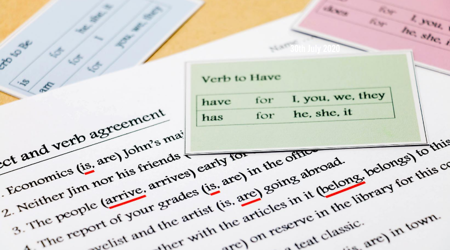
Brush up your grammar skills in this latest blog from Billy Burgess, and start writing better emails, reports and social media updates.
Course Updated: Excel Charts in Detail
So, you have put all of your data into Excel. But what is it telling you?
You need a chart, probably several charts. But which chart?
Assumptions, Guesses and Pivot Tables: From Data to Discovery

How well do you know your business? Do you know how well you’re doing? What your costs are? How happy your customers are? How happy your staff are?


